Client Brief
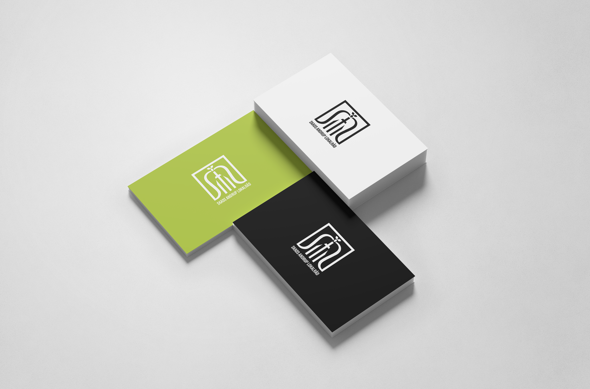
Skads Andrup Local Council must have a new LOGO. The logo must contain the text “Skads Andrup Lokalråd” and it must be possible to use the logo both in color and black and white.
The research
Composite village community consisting of the two towns Skads and Andrup both of which have been developed as suburbs with the cooperative movement, Brugsforeningsbygningen.
Skads Andrup and surroundings are defined by Skads parish. Through the cities runs the old highway A1, runs through the cities. Skads and Andrup would like to be tied together more so that there can be further coherence between the cities.
The first and most important link between the villages is the church.
It is important for the survival of the urban community that Skads-Andrup is considered as a unit but not as an extension of Esbjerg.
The logo
The logo contains the letters S, A, L , the church motiv and aims to depict unity and a complementary structure.
Primary Inspirations
Landbrugsforening
Skads Church
Keywords
A unit but not an extention
Highway connecting the two cities
Unity


Components
The logo is composed of components that play a crucial role for Skads Andrup council. There are references to Brugsforeningsbygningen, Skats Church along with a motive displayed on the ceiling of the church, roads that combine the two cities, Skads Andrup Council initials, unity and connection.
Inspirations


